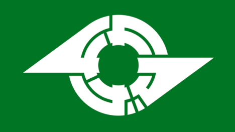
[Typographic logo for Kamagaya (Chiba) spells town name in katakana]
Japanese town logos -- official symbols designed to communicate the identity of each municipality -- come in a vast array of shapes and colors. Many of these municipal symbols incorporate typographical elements (particularly kanji, hiragana, katakana, and Roman letters) into their designs. In most cases, the stylized characters are straightforward and easy to spot (even if you don't read Japanese), but sometimes you have to bend your eyes to see them. The more complex logos encode the name of the town into a puzzle-like symbol that begs to be deciphered. Here are a few typographic town logos that make clever use of hiragana and katakana characters. (The examples are arranged in Japanese alphabetical order and include a mixture of both alphabets.)
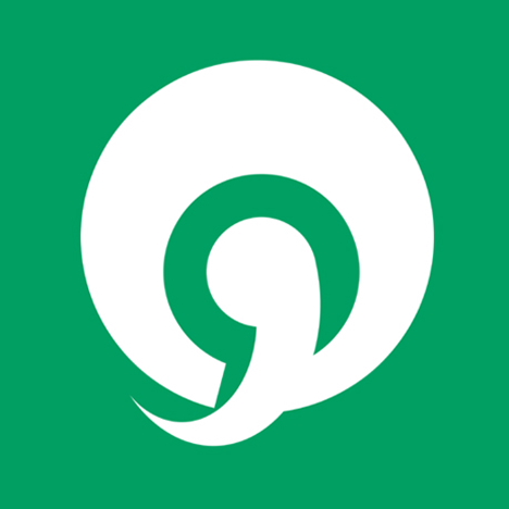
[Abiko, Chiba]
A: Abiko's logo uses a stylized katakana ア (a) that symbolizes Lake Tega.
* * * * *
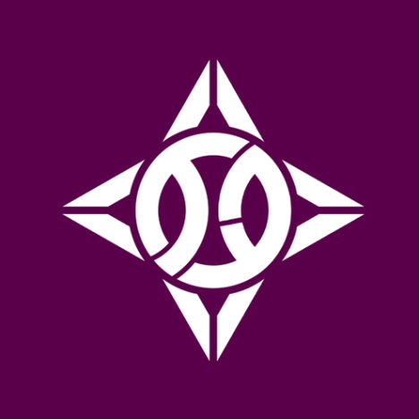
[Itabashi, Tokyo]
I: The picture-puzzle logo for Tokyo's Itabashi ward consists of the katakana イタ (ita) surrounded by four (shi) katakana ハ (ha) -- the katakana ハ (ha) is a variant of バ (ba). Together, the elements express the name "Itabashi" ("ita" + "ha" + "shi").
* * * * *
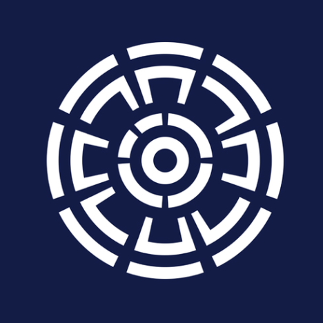
[Urakawa, Hokkaido]
U: In Urakawa's design, a stylized kanji 河 (kawa) is surrounded by four sets of the katakana ウラ (ura), which represent the four municipalities that joined together in 1902 to form the current town.
* * * * *
[Ebino, Miyazaki]
E: Ebino's hiragana え (e) is in the shape of Mt. Kirishima.
* * * * *
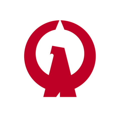
[Owase, Mie]
O: Owase's town logo consists of a katakana オ (o) in the shape of an eagle (pronounced "wase" in the local dialect).
* * * * *
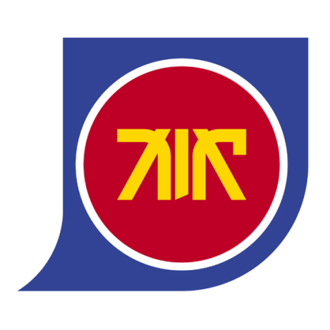
[Kanoya, Kagoshima]
Ka: The blue shape represents the Osumi peninsula, and the red circle with the gold katakana カノヤ (Kanoya) represents the city.
* * * * *
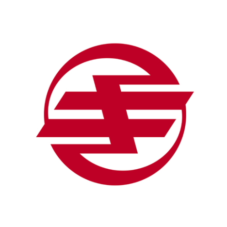
[Kikai, Kagoshima]
Ki: The logo for Kikai consists of a stylized hiragana き (ki).
* * * * *
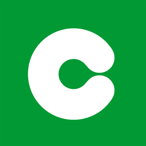
[Kumamoto, Kumamoto]
Ku: Kumamoto's logo is a rounded hiragana く (ku).
* * * * *
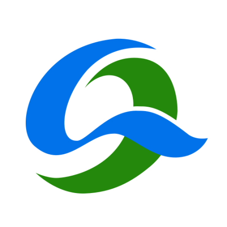
[Kesennuma, Miyagi]
Ke: The logo for Kesennuma consists of a hiragana け (ke).
* * * * *
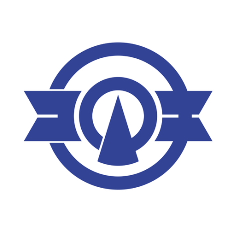
[Komaki, Aichi]
Ko: The katakana コマキ (komaki) in this logo is designed to represent an airplane engine.
* * * * *
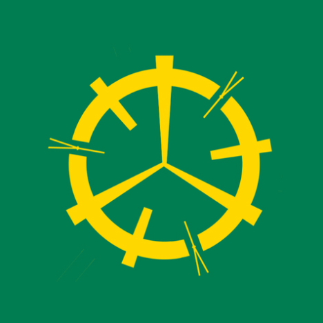
[Misawa, Aomori]
Sa: In Misawa's picture-puzzle logo, the three (mi) katakana サ (sa) form a ring (wa). The Y-shaped objects are pine needles.
* * * * *
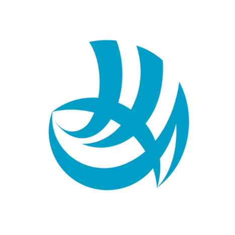
[Shimonoseki, Yamaguchi]
Shi: Shimonoseki's logo consists of the hiragana しも (shimo) in the shape of a puffer fish.
* * * * *
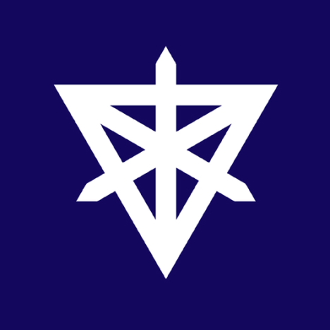
[Sumida, Tokyo]
Su: This symbol for Tokyo's Sumida ward is composed of the katakana ス (su).
* * * * *
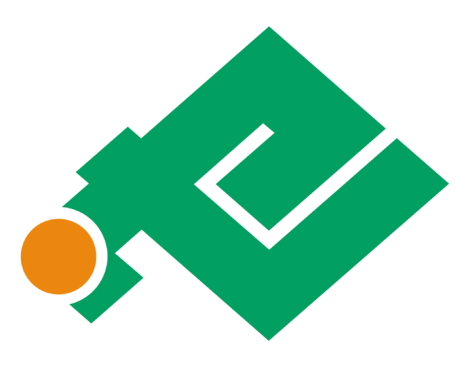
[Setana, Hokkaido]
Se: The katakana せ (se) is in the shape of Hokkaido, and the circle represents the town's location on the map.
* * * * *
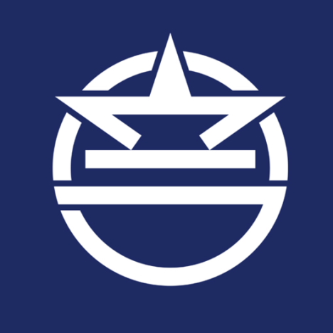
[Urasoe, Okinawa]
So: The logo for Urasoe is said to incorporate the katakana ウラソエ (Urasoe), though the ソ (so) and エ (e) are difficult to see.
* * * * *
[Tateyama, Chiba]
Ta: Tateyama's logo consists of the katakana タ (ta) on the left, テ (te) on the right, and the kanji 山 (yama) in the center.
* * * * *
[Chitose, Hokkaido]
Chi: In Chitose's logo, the hiragana ち (chi) is shaped like an airplane.
* * * * *
[Tsushima, Nagasaki]
Tsu: The six hiragana つ (tsu) in this logo represent the six municipalities that merged in 2004 to form the current city.
* * * * *
[Toride, Ibaraki]
Te: Toride's logo incorporates the katakana トリテ (torite). デ (de) is a variant of テ (te).
* * * * *
[Tōkai, Aichi]
To: The logo for Tōkai uses the hiragana とう (tō).
* * * * *
[Nankoku, Kochi]
Na: In Nankoku's logo, the katakana ナ (na) resembles a pair of wings.
* * * * *
[Niiza, Saitama]
Ni: Niiza's logo incorporates the katakana ニ (ni) and ザ (za).
* * * * *
[Numazu, Shizuoka]
Nu: The logo for Numazu depicts the katakana ヌ (nu) with pine needles.
* * * * *
[Nerima, Tokyo]
Ne: The logo for Tokyo's Nerima ward consists of a katakana ネ (ne) with a horseshoe-shaped center -- a reference to the "horse" kanji 馬 (ma) in Nerima.
* * * * *
[Minoo, Osaka]
No: Minoo's picture-puzzle logo consists of three (mi) katakana ノ (no).
* * * * *
[Hadano, Kanagawa]
Ha: The logo for Hadano consists of the katakana ハタノ (hatano) drawn to resemble wings. ダ (da) is a variant of タ (ta).
* * * * *
[Biei, Hokkaido]
Hi: Biei's logo design features the hiragana び (bi) in the shape of Mt. Tokachi. び (bi) is a variant of ひ (hi).
* * * * *
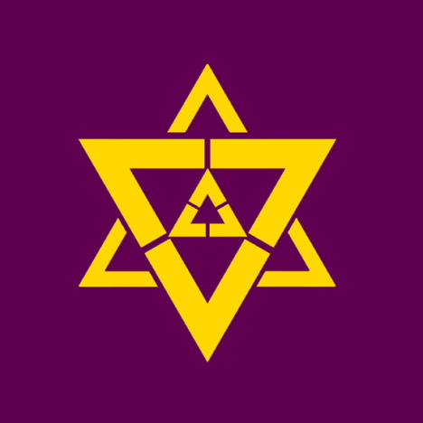
[Fukuchiyama]
Fu: The picture-puzzle logo for Fukuchiyama incorporates nine (ku) katakana フ (fu).
* * * * *
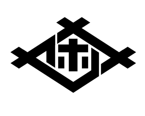
[Sasebo, Nagasaki]
Ho: Sasebo's logo is drawn with the katakana サセホ (Saseho). ホ (bo) is a variant of ボ (ho).
* * * * *
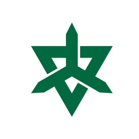
[Higashi-Matsuyama, Saitama]
Ma: This logo design consists of three katakana マ (ma). The symbol as a whole is meant to represent the kanji 東 (higashi), as well as the kanji 山 (yama).
* * * * *
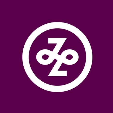
[Minato, Tokyo]
Mi: The design for Tokyo's Minato ward features a stylized version of the hiragana み (mi).
* * * * *
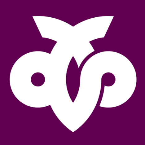
[Mutsu, Aomori]
Mu: Mutsu's symbol consists of the hiragana むつ (mutsu).
* * * * *

[Kameoka, Kyoto]
Me: Kameoka's logo design is said to incorporate letters from three alphabets, including the hiragana かめ (kame), the katakana カメ (kame), the roman letters KA, and others.
* * * * *
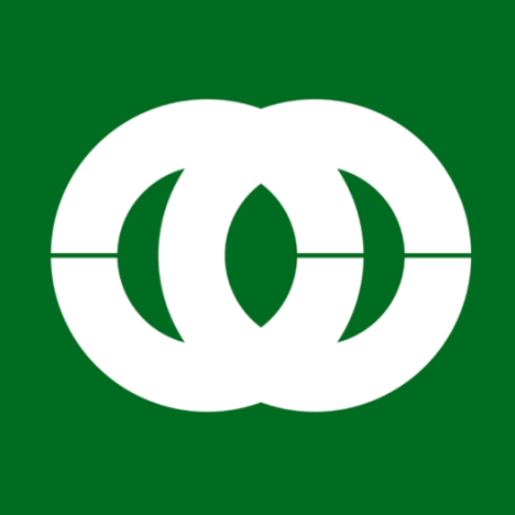
[Mobara, Chiba]
Mo: Mobara's town symbol is said to incorporate a stylized version of the hiragana も (mo), though it is difficult to make out.
* * * * *
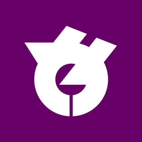
[Yachiyo, Chiba]
Ya: The logo for Yachiyo consists of the hiragana や (ya).
* * * * *
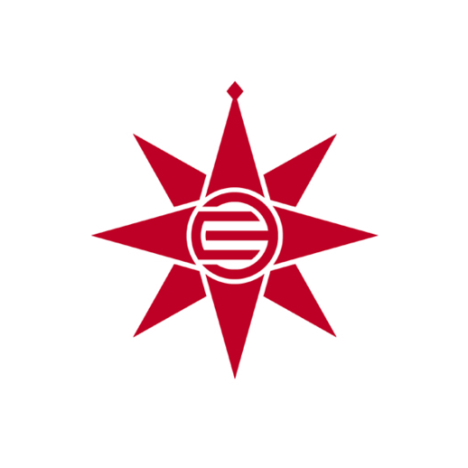
[Yokosuka, Kanagawa]
Yo: Yokosuka's symbol, which represents a mariner's compass, incorporates the katakana ヨコ (yoko) styled like the Miura clan symbol.
* * * * *
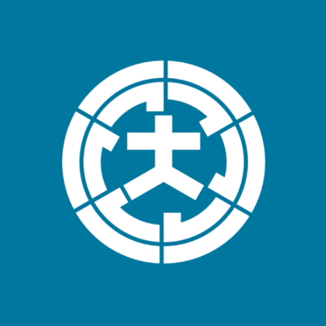
[Omura, Nagasaki]
Ra: Omura's picture-puzzle logo features the kanji 大 (oh) surrounded by six (mu) katakana ラ (ra).
* * * * *
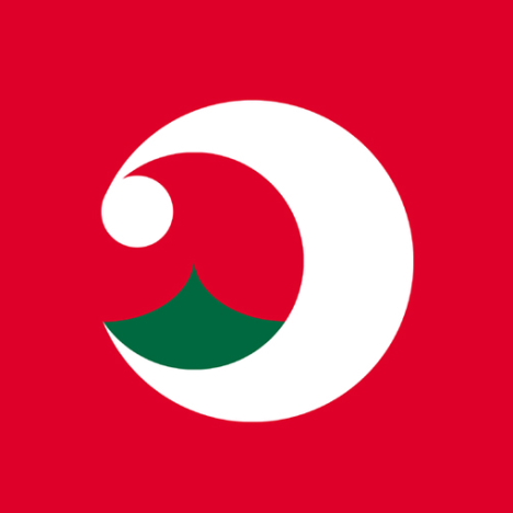
[Rishiri, Hokkaido]
Ri: Rishiri's symbol is said to incorporate the hiragana り (ri), which representing ocean waves, along with the hiragana し (shi), which represents Mt. Rishiri.
* * * * *
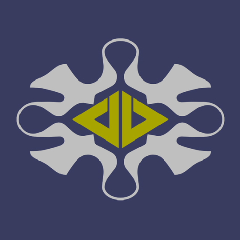
[Rumei, Hokkaido]
Ru: The logo for Rumei consists of the katakana ル (ru) surrounded by four seagulls.
* * * * *

[Rebun, Hokkaido]
Re: Rebun's town symbol incorporates the katakana レ (re).
* * * * *
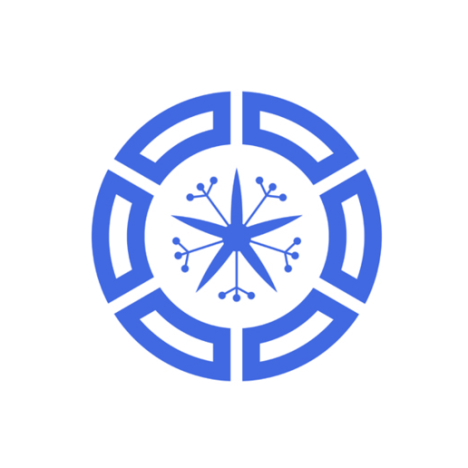
[Muroran, Hokkaido]
Ro: Muroran's picture-puzzle logo consists of six (mu) katakana ロ (ro) surrounding an orchid (ran).
* * * * *
[Tokorozawa, Saitama]
Wa: The picture-puzzle logo for Tokorozawa features a yam (tokoro) surrounded by three katakana ワ (wa). In Japanese, "three" is pronounced "san," which sounds similar to "za."
[More]

Mediumjones
Wow… incredible post! I really enjoyed it. I'm sure it will make the rounds in the graphic design communities.
[]lookiss
c"est clair ;)))
[]????
?????????????
[]?????????
Bri
This post was insanely interesting. I love it! Thanks for putting this lengthy piece together.
[]LondonArchaeologist
Sufficient alone to make you resent the Romans.
[]Tim W
I was thinking the same thing!
[]Pratish
very interesting!
thanks for taking the time to put these together.
[]wm
Such iconic futuristic pop-art icons.
[]Reminds me of icons designed by TheDesignersRepublic for wipEou7 2097
Pablo
I just designed one for Aira Town (???) for a competition. It was a very interesting project. with this logo i wanted to communicate the nature that surrounds the place, Sakurajima mountain, and the energy of the towns coming together. and it also spells Aira in Katagana.
http://hilibos.com/design/aira.jpg
Wish me luck!
[]amused bystander
LA, what did the romans do this time?
[]Vjeko
This is unbelievable. It really shows the aspect of visual japan culture.
[]johnee
amazing. thank you
[]Matt
The Minoo, Osaka design looks like the cream logo.
http://www.3beat.co.uk/wp-content/uploads/2009/09/Cream-logo.jpg
[]person
1. Put all these on the back of a t-shirt
[]2. Sell them to tourists
3. Profit
ShigueS
Thank you very much for publishing it! Such a good reference... wow!
[]Rob
I think that in Chitose the red color and the kind of shine on the droplet are playing off of the face that chi can mean blood.
[]Teddy Bradford
I love how simplistic these all are! In fact, it looks like most only use two colors. Pretty impressive design work.
Thank you for posting these, they will be great for when I need a little inspiration.
[]